Why Sizing for Averages is a Bad Idea
- Logs & Metrics, Performance/Sizing, UberAgent
- Published Feb 4, 2016 Updated Feb 22, 2021
When sizing a new environment it is tempting to use averages. It seems the logical thing to do. But it also guarantees a bad user experience.
Example: Sizing an RDS or XenApp Farm
Let’s say you’re tasked with building a new Citrix XenApp farm. Being a diligent IT person you set up a pilot: one or two machines with all the right software and settings. Then you carefully select a group of pilot users in such a way that they represent the organization’s employee types statistically correctly. Then you let them work on the new platform, ironing out bugs and such. At the end of that period, you have a great new platform. But there is one big question left: how many servers to buy?!
That should be easy to answer, should it not? After all, you have real users running real applications. All you need is a tool that tells you what the session footprint is in terms of CPU, disk, and memory. If you are on Server 2012 R2 or newer you might be tempted to use Task Manager’s users tab: it displays the current utilization of CPU and memory (for some reason disk and network usage is only shown on client versions of Windows).
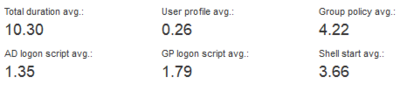
Gotcha: Task Manager shows the current utilization. You want the average. And you do not want it per session, you want the average of all the user sessions on all your pilot servers. This is where a tool like uberAgent comes in extremely handy. It shows you the average footprint per user session on its User Sessions dashboard:
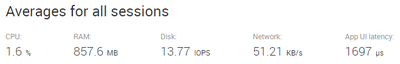
With these figures calculating the number of servers to order becomes child’s play, right? Wrong. Because averages are not what you need.
What is Wrong With Averages?
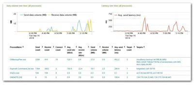
To understand why averages are not suited for sizing calculations let us compare one user’s resource utilization averages with their respective peaks:
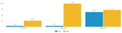
The data for the graph above was collected by uberAgent and visualized with a custom Splunk search (which you can find below). The difference between average and peak, especially in terms of CPU and disk utilization, is immediately visible.
An obvious objection presents itself: one might argue that not sizing for averages is all well, after all, there needs to be some room for periods of higher load. But sizing for the single peak that happens only once per day is not the right strategy, either.
Absolutely correct!
My answer to that is twofold. First, the data collected by uberAgent is averaged over the data collection interval, which has a default length of 30 seconds. That means the maximum CPU usage of 26.8% shown in the chart above was not a one-second peak but a 30-second tableau.
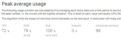
Second, uberAgent comes with a special sizing dashboard that gives you what we call peak average usage: it calculates the utilization for that one-minute period when the entire farm was under the highest load. Just what you need. It looks like this:
Takeaway
Do not size based on averages. Not even if you add a “safety margin” for periods of higher load. That margin is likely to be too small. Your farm will not have sufficient capacity during periods of higher utilization, resulting in poor user experience.
Instead sizing calculations should be based on an algorithm similar to the peak average usage mentioned above. Ignore individual short-term peaks, but prepare for periods of high load.
Splunk Search for the Average/Maximum Chart
I used the following custom Splunk search for the visualization comparing average and maximum load:
| pivot uberAgent System_SystemPerformanceSummary
   avg(CPUUsagePercent) as AvgCPUUsagePercent
   max(CPUUsagePercent) as MaxCPUUsagePercent
   filter host is HKW540
| eval Avg = round(AvgCPUUsagePercent,1)
| eval Max = round(MaxCPUUsagePercent,1)
| eval Metric = "CPU (%)"
| fields +
   Metric
   Avg
   Max
| append
[
   | pivot uberAgent System_SystemPerformanceSummary
      avg(IOPercentDiskTime) as AvgIOPercentDiskTime
      max(IOPercentDiskTime) as MaxIOPercentDiskTime
      filter host is HKW540
   | eval Avg = round(AvgIOPercentDiskTime,1)
   | eval Max = round(MaxIOPercentDiskTime,1)
   | eval Metric = "Disk (%)"
   | fields +
      Metric
      Avg
      Max
]
| append
[
   | pivot uberAgent System_SystemPerformanceSummary
      avg(RAMUsagePercent) as AvgRAMUsagePercent
      max(RAMUsagePercent) as MaxRAMUsagePercent
      filter host is HKW540
   | eval Avg = round(AvgRAMUsagePercent,1)
   | eval Max = round(MaxRAMUsagePercent,1)
   | eval Metric = "RAM (%)"
   | fields +
      Metric
      Avg
      Max
]
If you are familiar with Splunk the search above may look a bit strange: that is because we search an accelerated data model (more on that here).
By the way: if you find a more elegant way to get to the same result, let me know by commenting below.


Comments