Splunking the Aspect Ratio Distribution of National Flags
- Logs & Metrics
- Published Oct 30, 2018 Updated Apr 19, 2025
When I tried to align the Union Jack and the flag of Germany on a presentation slide I noticed that I couldn’t - their aspect ratios are different. A quick search led me to this list of aspect ratios of national flags on Wikipedia. Apparently, national flags are far from standardized. A broad range of aspect ratios is being used. I decided to start a little fun project finding out which aspect ratios are most common.
Wikipedia Table to CSV
Wikipedia’s list comes as an HTML table. I would need the data as CSV for any kind of further processing. As it turns out, there is a website for exactly that: Convert Wiki Tables to CSV. You feed it the URL of the Wikipedia page you are interested in and it converts any tables on said page to CSV.
Cleaning up the CSV
Ultimately I wanted to process the CSV data in Splunk because that is the analytics tool I know best. Before I imported the data into Splunk, however, I wanted to clean it up a little. For that, Excel seemed easiest. When you paste CSV into Excel it sadly is not smart enough to offer splitting it into multiple columns. But that is achieved easily enough with the Text to Columns function.
After I had split the comma-separated table fields into columns again, I noticed that the Ratio column had both the fraction and the decimal value, separated by a space, e.g., “2:3 (1.5)”. So I repeated the splitting procedure to move the decimal value into a new column I would then discard along with some other unnecessary columns. I was left with the two columns Country and Ratio.
Statistics
Once I had saved the resulting data to a new CSV file I turned to Splunk. The easiest way to import a CSV file is the Add Data wizard which guides you through the process. I had the wizard create a new index national_flags for the data I was importing so as to have a dedicated container that would later be easy to identify and ultimately delete.
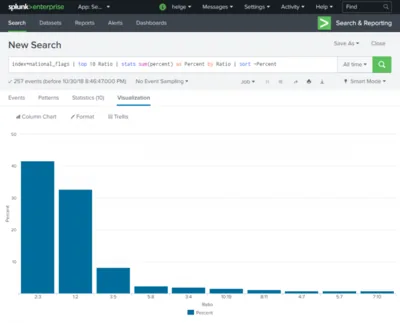
Once imported, I whipped up a quick SPL search to calculate the percentage of the 10 most common aspect ratios. When you are not totally new to Splunk these kinds of things are almost laughably easy, yet you always have full control over every aspect of the process. Here is what I used:
index=national_flags | top 10 Ratio | stats sum(percent) as Percent by Ratio | sort -Percent
Explanation of the Search
- index=national_flags
- Selects all data from the specified index
- top 10 Ratio
- Selects the 10 most common values of the field Ratio and adds a new field percent to every row
- stats sum(percent) as Percent by Ratio
- Groups percent (renamed to Percent) by Ratio. This is not strictly necessary but makes the visualization easier.
- sort -Percent
- Sort by the field Percent (descending)
Visualization
The only thing left to do was to click Visualization for Splunk to generate the following chart:

Popular Aspect Ratios
Out of the 257 national flags in Wikipedia’s list by far the two most popular aspect ratios are 2:3 (~42%) and 1:2 (~33%). The third most popular aspect ratio, 3:5, is already as low as ~8%.
Data Table
For those interested, below is a table of the aspect ratio distribution. I created it by running the following Splunk search, exporting the results to CSV and converting it to HTML here.
index=national_flags | top 200 Ratio
Aspect Ratio Distribution Table
| Ratio | count | percent |
|---|---|---|
| 2:3 | 107 | 41.634241 |
| 1:2 | 84 | 32.684825 |
| 3:5 | 21 | 8.171206 |
| 5:8 | 6 | 2.334630 |
| 3:4 | 5 | 1.945525 |
| 10:19 | 4 | 1.556420 |
| 8:11 | 3 | 1.167315 |
| 7:10 | 2 | 0.778210 |
| 5:7 | 2 | 0.778210 |
| 4:7 | 2 | 0.778210 |
| 1:1 | 2 | 0.778210 |
| ~1.618 | 1 | 0.389105 |
| 7:11 | 1 | 0.389105 |
| 6:7 | 1 | 0.389105 |
| 4:5 | 1 | 0.389105 |
| 28:37 | 1 | 0.389105 |
| 22:41 | 1 | 0.389105 |
| 2.6625:4 | 1 | 0.389105 |
| 2.338:3.608 | 1 | 0.389105 |
| 19:36 | 1 | 0.389105 |
| 18:25 | 1 | 0.389105 |
| 189:335 | 1 | 0.389105 |
| 17:26 | 1 | 0.389105 |
| 16:25 | 1 | 0.389105 |
| 15:22 | 1 | 0.389105 |
| 13:15 | 1 | 0.389105 |
| 11:28 | 1 | 0.389105 |
| 11:20 | 1 | 0.389105 |
| 11:18 | 1 | 0.389105 |
| 0.82 | 1 | 0.389105 |


Comments