uberAgent for Splunk: User Experience
Who said that end users get all the pretty UIs? Administrators are as happy as anyone to replace ugly consoles with good-looking HTML5 that runs on a smartphone just as well as on a PC.
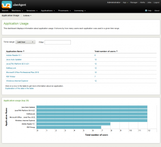
There is more to a great user experience than good looks, of course. As a monitoring tool, uberAgent needs to convert large amounts of data into information presented in a meaningful way. But it must also enable people to efficiently sift through the data themselves until they have the information they need – possibly even without knowing what that is going to be beforehand. In this post we will take a look at a few of the features that make this possible.
Filtering and Searching
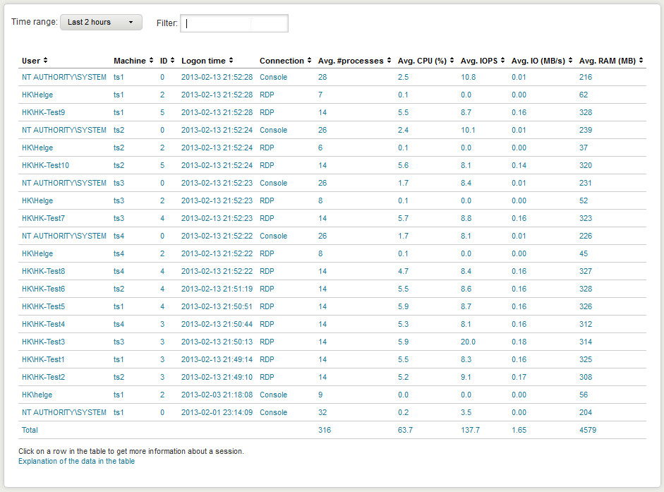
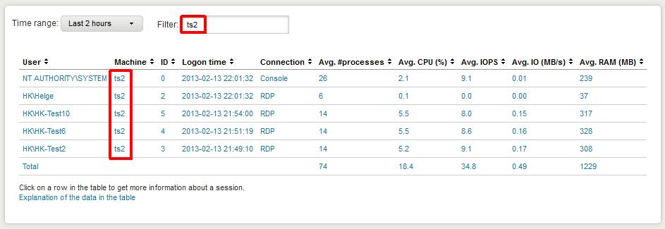
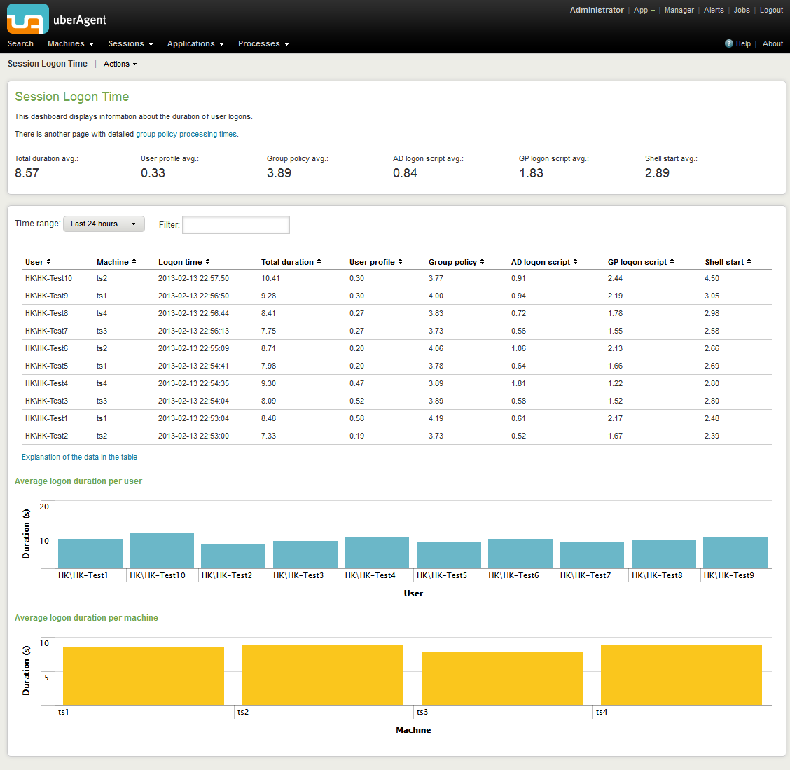
Nearly every dashboard is equipped with a little box labeled filter. It is as inconspicuous as it is powerful – it gets you from here:
to here:
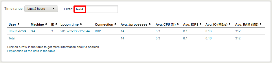
in seconds.
You are not limited to user names, of course. You can filter for any data in the table. E.g. enter a machine name to only display information about a specific computer:
Time Range Selection
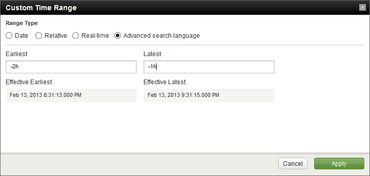
The when is just as important as the what. Every dashboard lets you easily choose the time range for which to display data:
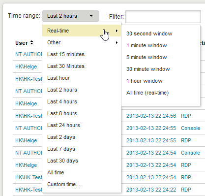
In addition to predefined intervals there are also auto-updating realtime views and an extremely flexible custom time range picker:
Info Tooltips on Graphs
uberAgent makes use of graphs extensively. However, have you ever seen a graph like this one and wanted to know a value exactly rather than “a little bigger than 400, maybe 420”?
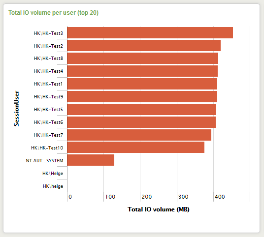
With Splunk, just hover over a bar and it will show you a tooltip containing the information you need:

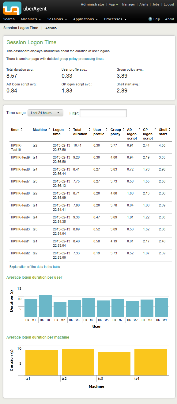
Fluid Layout
As can be expected from a modern web-based UI, Splunk comes with a fluid layout that uses the space of large screens well:
but is perfectly usable on smaller screens, too:
Digging Deeper
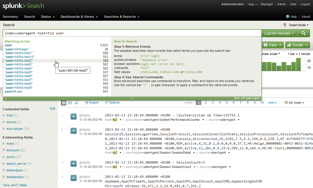
If you need more than uberAgent’s dashboards provide, just head over to Splunk’s native search app which gives you full access to all data:
Beta Version Coming Soon
More information will be published soon in this blog and on uberAgent’s website. While you are waiting for that, register for the upcoming beta by sending e-mail to helge at helgeklein.com.